We use cookies to make your experience better. To comply with the new e-Privacy directive, we need to ask for your consent to set the cookies. Learn more.
Cheap Joe’s Art Stuff Art Blog
Tips, Tricks, Thoughts, and inspiration from across the art spectrum.
Gouache Squash

Hello, everybody!
If you’ve been following the blog for a while, you may remember the post that Mona Lisa did explaining gouache.
If not, and you’re not familiar with gouache, I suggest checking it out! People will tell you that gouache (pronounced “gwash”) is basically “just opaque watercolor”–but it’s a true and entirely different beast altogether.
Imagine the fluidity of watercolor–but none of its handling abilities–with the look of acrylic. A better description for it would be a liquid acrylic that you can water down.
It’s easy to control, but a little hard to master. And I can tell you from this experience, that the more colors you have…the better.
My subject for this project was this photo of three squash from Grit.com.
That means I’m going to have…gouache squash.
Come on, now THAT is just fun to say!

My palette consisted of Permanent White, Spectrum Yellow, Spectrum Red, Jet Black, Brilliant Green, and Ultramarine in the Winsor & Newton Designers Gouache line. (I chose the primaries and green because I hate mixing green, and I set them up in this fashion because I knew I would need to mix yellow, red, blue, and white at some point–so one well is for the pure color and the other is for mixing.)
I think having a limited palette in watercolor can be economic and easier for users, but I definitely would have picked up a few more shades of gouache had I known how strange they are to use…

I start off with my sketch on 140 lb. Hot Pressed Arches Watercolor Paper. I’m not too worried about pencil lines because I know my color is going to cover it–even lighter colors like yellow and white!

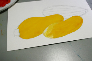
Right away, I mix up some Spectrum Yellow with a touch of Red to get this sort-of Naples Yellow Hue.
I applied the first coat somewhat unevenly because gouache has a very fast drying time, but it’s okay! Like acrylic, adding MORE of the paint in one area won’t drastically change its value (like with watercolor).
So that is something to keep in mind, especially if you’re expecting gouache to layer like watercolor…because it won’t.

Because of the quick drying time, I was able to paint the shape directly beside my first shape (a HUGE watercolor no-no! See? I told you they’re not just like watercolors!) and I painted it in exactly the same shade of yellow as my other squash.

In the reference photo, you can see that the front squash is actually a bit lighter than the yellow one behind it. Instead of mixing up a new batch of paint (like I would have to do with acrylic), I just painted white on TOP of my lighter squash.
As you can see, the white starts off pure, but fairly quickly reactivates and works itself into the color that’s beneath it, creating a color mix that happens right on your paper!

So I worked some white into my front squash and added a few more layers of darker yellow to the shadowy bits of my second squash.

Next, I mixed up some Brilliant Green and Ultramarine to get this darker green and applied it to the lighter stripes on my zucchini (I started with the light stripes because I knew I would be adding white to them and I wanted them to dry sooner). I also added some green to the stem of my second squash, as well as some highlights and shadows to both of the yellow squash.
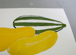
After a few applications of white to my zucchini, my color turned to a chalky greenish-blue color–not ideal for zucchini. But no worries! I added some of the yellows from my squash to the top, let it mix it, and got this lovely yellowish-green!

The green I had originally made proved to be a good dark green stripe color for my zucchini, so I stuck with it. I also mixed some yellow into the stem of my second yellow squash.
Now it’s time to give these guys some dimension.

I wanted a purple shadow because shadows are almost never actually black and because purple is the complement of yellow. I mixed Spectrum Red and Ultramarine with just a pinch of my squash yellow to bring the tone down and add some harmony to the colors.
I achieved this shadow by making a heavy line around the edges of my squash and then dragging the color out with water.
There was also a slight shadow between the two yellow squash, so I carried the pigment left on my brush and just applied it to that curve.

After a few added details and a stamp to show who made it, I was finished with my gouache squash!
Let me know what kind of experiences you’ve had with gouache–love it? Hate it? Love to hate it?

Recent Posts


