We use cookies to make your experience better. To comply with the new e-Privacy directive, we need to ask for your consent to set the cookies. Learn more.
Cheap Joe’s Art Stuff Art Blog
Tips, Tricks, Thoughts, and inspiration from across the art spectrum.
Pigments of Your Imagination!

Hey, everybody!
You may recall a post I made a few months ago where I used alcohol inks on glass to make votive holders, but this week I literally took a page out of Cathy Taylor's book, Pigments of Your Imagination: Creating with Alcohol Inks, and painted with them like watercolors! This was also an excellent opportunity to test the NEW Ranger Tim Holtz Adirondack Alcohol Inks! You might be thinking, "Alcohol inks. Okay. What is so special about these?" Something that sets this line of inks apart from others is the incredible range of colors Tim Holtz has created. 59 beautiful, highly-pigmented colors guaranteed to make your work pop! Not to mention, they're also Acid-free and lightfast, so you can rest easy knowing that your work won't tarnish over time! But don't just take my word for it, see for yourself!
My reference photo for this project is a Monarch butterfly from the Wildscreen Arkive.

I began simply by sketching my butterfly onto a sheet of Yupo Watercolor Paper.
Yupo is by far the best paper for working with alcohol inks because it's non-porous and alcohol inks already have an incredible evaporation time, so Yupo makes it a lot easier to work with them. They're also able to be reworked (as you'll see later in this post) and that would be very difficult on cotton paper.
As is typically the fashion when working with alcohol inks, I started with my background.

To protect my white space and save myself a massive headache later on, I masked my butterfly and flowers with Rubber Cement and an Uggly Brush
.

Once that dried, I dove right in by dropping a handful of colors (Clover, Citrus, Stream, and Aqua) as well as some Ranger Tim Holtz Adirondack Alcohol Blending Solution, to dilute and spread the pigments around.

Then I tilted my paper to help the spreading along a bit.
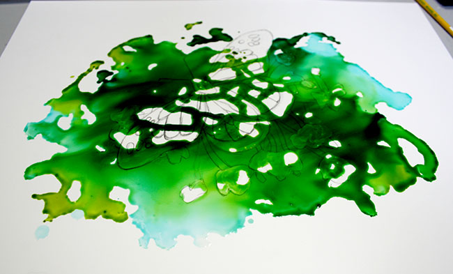
Added a bit more ink and tilted the paper different directions...

Until I ended up here.
That looked okay, but I knew (from my last alcohol inks post) that hitting it with some canned air would give me great layers and effects.

And I was right! That's much better.
It didn't take too terribly long for the inks to dry, even with a ton of them caked on like that.

Once they were, I used my Cheap Joe's Masking Fluid Pick-Up to remove the Rubber Cement.

I was left with a mostly-white butterfly and flowers. It would appear that I got too eager in waiting for those inks to dry (to be fair, I waited MAYBE 15 minutes...) and smudged them a little.
But it's okay!

With a little Blending Solution, or just regular old rubbing alcohol, and a Scrubber Brush, I was able to get up everything I wanted! (I left some, just for dimension.)
With everything looking MUCH whiter, I started in on the butterfly's wings.

Again, because these guys dry so quickly, you're not going to want to drip them into a palette like you would watercolors. Instead, I took advantage of the tiny tip on the bottles and squeezed a few drops directly onto my Miller's Pseudo Sable Brush.
I painted in each section one by one with Sunset Orange and the smaller spots with Sunshine Yellow.

One of the best qualities of alcohol inks is their longevity of them. With only a few drops, I was able to paint in all of the orange on my butterfly! I'm serious!

My next step was to mask the little white dots around the edges of the wings.

While that dried, I painted my flowers with Cool Peri. I followed the same pattern as I did with the orange sections of the wings, just taking it one shape at a time. Alcohol inks tend to pool around the edges, so I used that to my advantage when creating my petals! The insides of the flowers are about 3 coats of Cool Peri, while the outer highlights are a single coat.

Next, I combined lifting/reworking my background green with additional Citrus on my brush to make the flower stems. Again, the pooling at the edges provided a great divider between the stems and similarly-colored background.
I also painted the final, black sections with Pitch Black--and it REALLY is pitch black!
This color is so packed with pigment that it didn't waver or pool like the others. Dripping it onto a smaller brush made for an excellent liner!
My final step was just to remove the masking from my white dots.

And presto!
I am so impressed with these inks. Their vibrancy and harmony with each other is absolutely breathtaking.

For tutorials like this one and even MORE, pick up Pigments of Your Imagination today! Or you can see and learn from Cathy in action if you register for her 2016 Cheap Joe's Workshop!>
-
 Pigments of Your Imagination 2nd Edition: Creating with Alcohol Inks$26.99
 Best Price - This is the lowest price offered for an item. Additional discounts cannot be applied.


Recent Posts


