We use cookies to make your experience better. To comply with the new e-Privacy directive, we need to ask for your consent to set the cookies. Learn more.
Cheap Joe’s Art Stuff Art Blog
Tips, Tricks, Thoughts, and inspiration from across the art spectrum.
Artist Tip 29: Exploring Opaque Watermedia


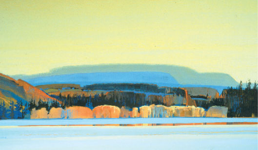
Casein and acrylic on Crescent W/C board, 19" x 35"Because it is insoluble when dry, acrylic was used as a transparent underpainting to achieve a radiant, rich color. Casein was applied in translucent and opaque layers over the acrylic. Casein with its velvety, matte surface quality is the right choice to capture snow, shadows, and tree patterns of a Colorado winter.
To most of us the term watermedia is a recent one, originating in the late 1960's or early 70's. At that time some watercolor painters began exploring and experimenting with the various possibilities of using gouache, acrylic and casein in a fluid, watercolor approach. They employed these media to create transparent, translucent (semi-opaque), or entirely opaque layers. With gouache, acrylic, and casein they could achieve a more varied and expressive surface quality than theycould with pure, transparent watercolor.
Because of this explosion of new methods of painting in the watercolor world, most watercolor societies now simply ask that entries for their exhibitions be watermedia on paper. Paintings can be totally transparent or totally opaque; and many exhibitions will accept collage, as well as drawing media, combined with the watermedia.
New Possibilities
I feel that the increased use and acceptance of opaque watermedia has been a very important development in watercolor. The inspiration and creative idea should be the painter's most important concern, while the methods and media should be used to help each artist most closely reach his vision. Each medium has different visual qualities and handling characteristics and can provide many new and expressive ways to put paint on paper.
The foundation for our present-day painting with opaques in watermedia actually dates to the 18th and 19th century English watercolor school. Many of these painters, such as David Cox, William Blake, Samuel Palmer, William Turner, John Ruskin, Dante Gabriel Rossetti, and John Constable, worked freely with both transparent and opaque watercolor. They termed opaque watercolor "body color" or color with body. This is the same paint that today we call gouache.
In our own American school of master painters the most pre-eminent, such as Winslow Homer, John Singer Sargent, Maurice Prendergast, John Marin, and Charles Burchfield, all used opaques whenever they felt it to be important to the painting. Their expressive message was more important to them than the technique they employed. Thus, we are left first to feel the power of their statement, and second, to study how they used the paint.
Today there are many well-known watermedia painters and instructors that work with opaques. Serge Hollerbach, Carole Barnes, Carrie Brown, and Michael Schlicting are but a few who are working with and teaching some very exciting directions in watermedia.
Each of the watermedia have their own visual qualities and handling characteristics. I will give a brief description of the watermedia—gouache, acrylic, and casein—followed by a chart that will compare the four watermedia, including transparent watercolor.
Gouache
I recommend that a transparent watercolor painter interested in exploring the possibilities of opaque watermedia start with gouache. This is because it has the same binder (gum arabic) as watercolor and also a similar feel on the brush when applied to the paper. It remains soluble after drying and can be lifted as easily as watercolor pigment. It can be used transparently to achieve a gentle, soft, matte quality. Translucent applications have a beautiful milky, velvet look. (Gouache is by far the most opaque of all the watermedia allowing you to paint light areas over a dark. However, you must be careful when applying one layer over another as the undercolor can lift.) Light tones will dry a bit darker, and dark areas will dry slightly lighter. For thin transparent to medium opaque applications of paint, any paper surface can be used. If thicker impasto layers of paint are desired, paint should be built in layers, letting each layer dry completely before adding the next. A rigid support, such as a watercolor board, should be used. If permanency is important to you, check the permanency rating (often found on the tube's label) or stick to traditional colors such as cerulean blue or burnt sienna. Some colors in gouache are made for advertising and commercial art and are not permanent. Brushes can be cleaned easily at the end of the painting period with liquid soap and lukewarm water.
Casein
I call casein the gentle medium because it has such a soft, warm, velvet-matte appearance when it is used transparent to opaque. Casein was used quite extensively before the development of acrylics in the 50's and 60's. It is only in the last few years that artists have become reacquainted with this medium and have discovered its unique visual qualities. It is manufactured in the United States by Shiva and has a milk base binder (curds). Casein is not as widely available in art stores as other watermedia pigments and has a relatively short shelf-life (about two years). It can be used transparently, but its intended use is in translucent to opaque applications. Some colors dry immediately, impervious to water, while other colors will take up to two weeks to become insoluble. The painter can build layers of paint without disturbing the under layers at any time if the brush is not used too vigorously. Casein is very opaque and flows well off the brush with great covering power. The darks will dry a bit lighter and the lights a bit darker. Any paper support can be used for thin-to-medium application of paint, while a rigid support such as a watercolor board should be used for thick, opaque applications. Brushes must be carefully cleaned with liquid soap and warm water after use. I use one set of brushes for acrylic and casein and another for watercolor and gouache.
Acrylic
Acrylic is a poly-resin based paint developed for artists in the late 1940's and 50's. It is by far the most versatile of all the watermedia. It can be applied to any non-greasy paper support and can be used for entirely transparent paintings or, to the other extreme, for thick, opaque impastos. When used transparently, it has rich, luminous color, far greater than any other medium. When applied transparently with a watercolor approach, it has the advantage and disadvantage of becoming insoluble once dry. Thus, the paint can not be lifted, but layer upon layer of glowing transparent color can be added, one over the other, without disturbing the under-lying layer. Acrylic is not a highly opaque paint. It may require several coats of a light opaque color to cover up a dark under-layer. This again can be an advantage, allowing you to apply layers from light to dark and then dark to light. Each subsequent layer will have a more translucent look and show the building-up of the applications underneath. Opaque paintings produced in acrylic will often have a detectable plastic sheen to the paint surface. There is also a "synthetic" feel to the brush when mixing and applying the paint. Acrylic is compatible with all of the watermedia and can be used extensively for collage or combined with drawing media. Most authorities feel, even though acrylic is a relatively new medium, that it will prove to be the most permanent of the watermedia. Acrylic is used by more artists than any other medium, and it is estimated that at least one out of three painters use it to some degree in their work.

Acrylic on Crescent watercolor board, 25" x 34"This painting, done in the studio, focuses on the transparent, translucent, and opaque surface qualities of the medium. I chose acrylic for this subject because of the medium's rich, intense color, its ease in handling, and its differences in opacity and surface effects.
Making A Choice
Once you're familiar with these four watermedia, you can select the one that will best express your response to your subject. For instance, when I am painting a hot, colorful autumn vista in New Mexico, I would choose acrylic. An on-location, translucent to opaque, hazy-bright subject in Tuscany may best work in gouache, while a soft, damp day with gentle light on the Oregon coast definitely calls for casein. The beautiful, shimmering green abstract patterns of early summer aspen and spruce may best be described in transparent watercolor.

Gouache on Fabriano paper, 12" x 18"Gouache was selected to help achieve the blue, hazy atmospheric quality of Tuscany in September. The medium is used transparent to opaque with some of the white paper showing. In some instances, I have lifted the stems of the sunflowers after the paint was dry.
Combining Watermedia
I like to experiment by combining watermedia. Mostly, I will play the transparency of one medium against the opacity of another, emphasizing the interaction of the varied surface qualities. Many times when I use watercolor, I will combine it with gouache. They are compatible, having the same binder of gum arabic and a similar feel on the brush. They also provide a full range of surface qualities. If I use acrylic, most of the time I will mix it with casein. The acrylic is used for the luminous, transparent underpainting that is insoluble once dry. Because the acrylic glazes will not lift, overlays of translucent and opaque casein can be added. This combination plays the rich, luminous glow of transparent acrylic against the beautiful, velvet-matte of opaque casein.
I've included a chart that will help you understand and explore new possibilities in opaque watermedia. Let's take a look at what you can do with opaque watermedia.

The Qualities and Characteristics of Watermedia - Download a printable version of this chart.
Download a printable version of this article as a PDF.


