We use cookies to make your experience better. To comply with the new e-Privacy directive, we need to ask for your consent to set the cookies. Learn more.
Cheap Joe’s Art Stuff Art Blog
Tips, Tricks, Thoughts, and inspiration from across the art spectrum.
Papers and Bubbles and Oats, Oh My!

Hello, everyone!
I know I’ve been going pretty heavy on watercolor lately, but those posts seem to garner the most attention!
–And they’re so versatile that I can make multiple posts about them… But I promise to get back to my regularly-scheduled mixed media blogging after this short message about how much fun I had making textures!
Since watercolor is typically a ‘flat’ medium–in that it doesn’t cake up the way acrylic and oil would–it can be difficult to make visually interesting textures without adding a bunch of other colors.
Well, I’m going to show you how you can get various effects with a single color and a few household items AND how they can be applied to your work!
For the tests, I used one of my favorite colors, American Journey Artists’ Watercolor, June Bug, and 140 lb. sheets of Kilimanjaro Original Bright White Watercolor Paper cut into squares.
Now, I’m sure you all know about the salt trick. But have you tried different kinds of salts on papers varying in wetness?

Fine Salt (Wet)

Fine Salt (Damp)

Fine Salt (Dry)
For my first round of tests, I used three different degrees of wetness with simple table salt and got a few results.
The first photo was a sopping wet wash with a generous amount of salt sprinkled over it. The second photo is another wash that I let dry for a minute or so before adding the salt. The third is mostly dry (no longer shiny), just to see what some slight moisture would do.
As you can see, water is the clear ingredient in making the salt effect happen. The first photo shows a very obvious effect, while the second and third render only slight textures.
(Feel free to click the photos in order to zoom in and get a closer look!)
With the Wet Salt, you could hone this technique and use it to make leaves on a tree! As for the others, they’ve produced a very sandy quality in how fine the detail is, so just throw some salt down next time you’re painting a beach scene!
My next test was with coarse salt!

Coarse Salt (Wet)

Coarse Salt (Damp)

Coarse Salt (Dry)
Of course, this test gave similar results because salt is salt. But where the fine salt completely broke down into the painting, the coarse salt remained, giving a more concentrated effect.
Again, the photos follow the pattern of sopping wet, slightly damp, and fairly dry.
The damp and dry tests yielded similar effects to their fine counterparts, only a little more intense.
To me, the Wet Coarse Salt looks like little flowers, so this technique could be used to easily make a field of wildflowers!
I decided to stick with this absorbency trend and try rice next!

Rice (Wet)

Rice (Damp)
Once again, the wet wash proved to be a better catalyst for our textures.
I didn’t do a dry test for the rice because I knew that its absorbency rate wasn’t nearly as high as salt’s, and it would likely have no effect–and after seeing how minor the effect is on the damp test, I know that I was right!
The faint, oblong texture kind of reminds me of cobblestone. So these could be used as a quick alternative to painting tiny rectangles if you’re working on a street pattern!
At this point, I wondered what other kinds of absorbent food-things could I use…
How about oatmeal!

Oats (Wet)

Oats (Damp)
As it turns out, I was kinda right!
The steel-cut oats I used gave a texture similar to rice, only without the little dark spots of color left behind!
Once again, the more water, the better. But both wet and damp were pretty effective.
This technique could be useful in lifting very small sections of color–like you could with salt–only with much more control.
Next, I stepped away from food and onto other absorbent things, like paper!

Crumpled Paper

Ripped Paper
Here, I tested both crumpled paper (pressed into the test with a book weighing it down) and ripped paper (pieces applied randomly).
The crumpled paper gave a much milder effect than expected. This is definitely something you’d have to play with because it’s hard to tell exactly where the paper will touch your painting until it’s actually on the painting.
As for the ripped paper, I think it did a solid job of absorbing the color and leaving fascinating markings.
The crumpled effect could be useful if your subject needs to look dated or, well, crumpled. And if you position the pieces of paper beside each other, the ripped effect might be nice for close-up bark on a tree!
Wax Paper (Wet)
The word on the street was that you could use wax paper to create compelling patterns in your watercolor, but I had never tried, so I gave that a go next!
The result was…kind of underwhelming. My strips of wax paper kept rolling up onto themselves, and I using a book to weigh them down was pretty out of the question, as I didn’t want to leave impressions from the book on the test OR get watercolor on any of my books. So I was left with these dinky little segments.
This did prove to be an unusual discovery, however. Unlike regular paper, the wax paper didn’t absorb any of the color. It only pooled it together! All you really need to do is master the application of wax paper, and you could have a very unique texture on your hands!
With my absorbency experiments coming to an end, I moved on to an old favorite: saran wrap!

Crumpled Saran Wrap

Stretched Saran Wrap
With the saran wrap, I tried two different application techniques: crumpled and stretched. (The darker parts are where the saran wrap actually touched the paper.)
Saran wrap is perfect for stuff like this because it’s reusable and allows for easy repositioning and manipulation.
This is definitely a technique that is easier to control, and has a lot of forgiveness. Consider them for a pattern on clothing, or perhaps an abstract background!
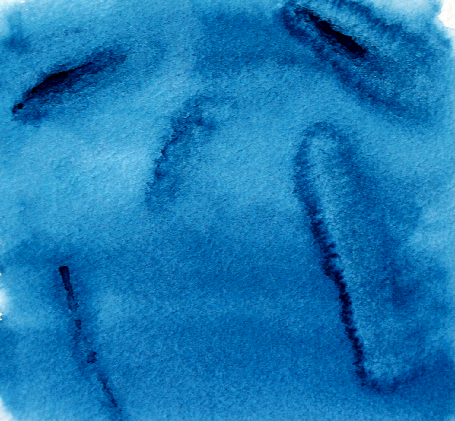
Next, one of my new favorites: rubbing alcohol!

Alcohol (Wet)

Alcohol (Damp)
Alcohol (Dry)
When I heard that you could use rubbing alcohol on watercolor, I was in disbelief and immediately had to see for myself. What I ended up with truly stunned me!
When used on wet watercolors, not only does the alcohol almost completely lift color, but it’s nearly effortless!
All I did was drip a few drops with a paintbrush and it immediately soaked up the pigment and made it disappear.
I wanted to see what kind of control I had with this sort of power, so I painted some swirls, and look! It gives you a TON of control! As long as you work fast–since this works best on VERY wet watercolor and doesn’t work at all on dry watercolor–the possibilities are endless!
Get a Cheap Joe’s Fritch Scrubber Brush in there and you could REALLY take up some color!
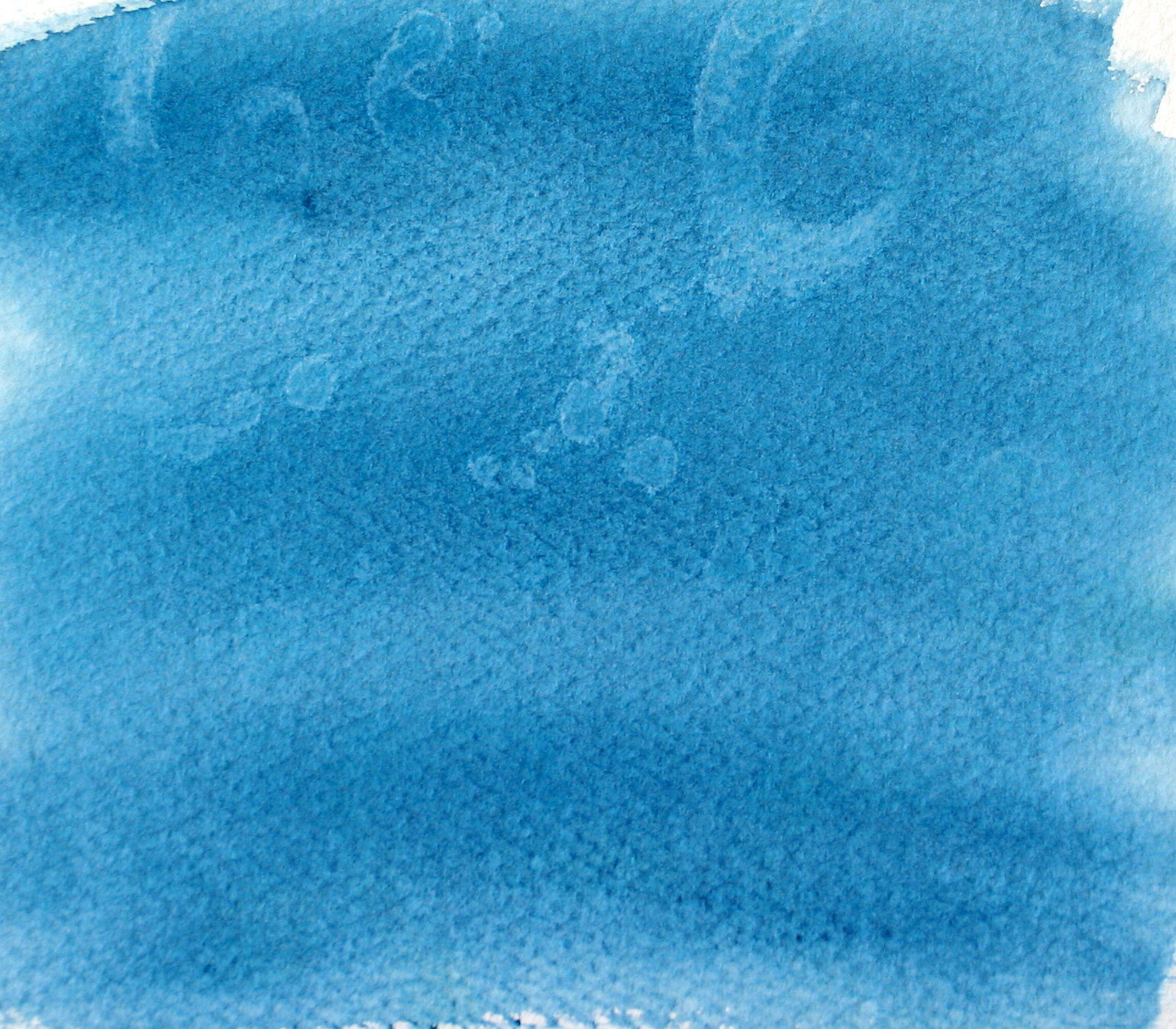
And finally, my absolute favorite of the bunch…bubbles!

Bubbles

Bubbles Layered
You heard me right! Bubbles!
This test was particularly remarkable to me because I had VERY little control, but I was pretty pleased with whatever was produced anyway!
To make this happen, all I did was add a little watercolor to some dish soap in a small, shallow container, blew bubbles into it using a straw, and pressed my paper onto the bubbles!
The only drawback here is that you have to watch your soap/water/watercolor ratio because too much water will dilute your color, and not using enough soap will make it harder to get bubbles.
In the tests above, you can see that I did one test of 2-3 applications of bubbles, while other has multiple layers.
Depending on what you’re going for, I think both textures look great! The first test could be a creative way to paint hydrangeas, while the second test might be an intriguing design for rocks or boulders!
I certainly hope these have helped expand your watercolor possibilities!
If you know of any other crafty ways to create textures in your watercolors, let me know!

Recent Posts


