The Versatility of Winsor & Newton Blues
Image showing brush making a watercolor wash Image showing brush making a watercolor wash

Enjoy this blog post highlighting the characteristics and versatility of Winsor & Newton Blues. Winsor & Newton offers the purest pigments which inspire artists to create in limitless ways. Discover endless color potential with Winsor & Newton Professional Colors.

Cerulean Blue

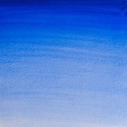
Watercolor swatch of Cerulean Blue Watercolor swatch of Cerulean Blue
Cerulean Blue
 
For a clue to its name origin, you need to look upwards. The word cerulean comes from the Latin caeruleus, meaning dark blue caelum, which in turn probably derives from caelulum, meaning heaven or sky.
 
After the discovery of Cobalt Blue by French chemist Louis Jacques Thénard in 1802, the Swiss chemist Albrecht Höpfner first created Cerulean Blue from Cobalt stannate in 1805. It is made by the calcination of tins, salts, and silica with cobalt sulfate and is an inorganic synthetic mineral pigment. It took a while for the color to become widely available to artists – over 55 years in fact – and was introduced in the 1860s under the trade name Coeruleum. 
 
Cerulean Blue was quickly adopted by artists, including the Impressionists, because of its hue, permanence, and opaqueness. It was particularly useful for skyscapes and can be found in the sky of Monet’s 1877 ‘La Gare Saint-Lazare’ the pointillism of Paul Signac and in Édouard Manet’s 1878 ‘Corner of a Café-Concert’. 
 
The color has received widespread popularity. In 1999 Cerulean was nominated by Pantone as the color of the millennium. According to Leatrice Eiseman, Executive Director of the Pantone Color Institute® “Psychologically, gazing at a blue sky brings a sense of peace and tranquillity to the human spirit. Sky blue is imprinted in our psyches as a retiring, quiescent color. Surrounding yourself with Cerulean blue could bring on a certain peace because it reminds you of time spent outdoors, on a beach, near the water - associations with restful, peaceful, relaxing times…”
 
And in the film 2006 film The Devil Wears Prada, cerulean is the shade worn by Anne Hathaway. It becomes the subject of a lecture by her boss, played by Meryl Streep, on the lineage and influence on cerulean in the fashion industry…“This stuff’? Oh, ok. I see you think this has nothing to do with you. You go to your closet and you select out, oh I don’t know, that lumpy blue sweater, for instance, because you’re trying to tell the world that you take yourself too seriously to care about what you put on your back. But what you don’t know is that that sweater is not just blue, it’s not turquoise, it’s not lapis, it’s actually cerulean. You’re also blindly unaware of the fact that in 2002, Oscar de la Renta did a collection of cerulean gowns. And then I think it was Yves St Laurent, wasn’t it, who showed cerulean military jackets? And then cerulean quickly showed up in the collections of eight different designers. Then it filtered down through the department stores and then trickled on down into some tragic “casual corner” where you, no doubt, fished it out of some clearance bin…”
 
Cerulean Blue pigment is an expensive pigment and remains as popular now as it was when it was first introduced.

Cobalt Blue

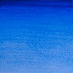
Watercolor swatch of Cobalt Blue Watercolor swatch of Cobalt Blue
Cobalt Blue
Cobalt Blue is a clean blue that is neither warm nor cold. With a moderate tinting strength, it is useful on the palette for muted color mixes. It is semi-transparent in both Winsor & Newton Artists’ Oil Color and Artists’ Water Color. Cobalt blue deep, a unique, red shade cobalt blue is made by using Cobalt zinc silicate. Until the nineteenth century the best blue pigment available to artists was ultramarine. Laboriously ground from lapis lazuli, a semi-precious stone mined only in distant Afghanistan, the prohibitive costs of this pigment prompted the Napoleonic administration to find an alternative. The chemist Louis-Jacques Thenard was commissioned by the French interior minister, Chaptal, himself an industrial chemist, to develop a synthetic substitute for ultramarine.
 
Thenard knew the famous Sevres potteries used salts containing cobalt (smalt) to produce their blue glazes, and in 1802, from a mix of cobalt salts and alumina, he produced a pigment called cobalt blue. With a purer tint than Prussian Blue, it was immediately taken up by artists. In fact, cobalt blue sometimes is called Parrish blue after the artist Maxfield Parrish who made famously intense blue skyscapes using this color.

Manganese Blue Hue

Watercolor swatch of Manganese Blue Hue Watercolor swatch of Manganese Blue Hue
Manganese Blue Hue

The name Manganese (MANG-ga-neez) comes from the Latin word magnesia, which is also the name of a region in Thessaly, Greece. This is where the ancient Magnetes tribe lived and where the mineral pyrolusite, the main ore of manganese dioxide, is naturally found. Although manganese dioxide is naturally occurring and used in early prehistoric paintings, it is a dark earth tone bearing no resemblance to the color we now know.

Manganese itself is not found as a free element in nature, and in 1774, the Swedish chemist Johan Gottlieb Gahn was the first to reduce a sample of manganese dioxide to manganese metal. Manganese Blue itself is a modern, inorganic synthetic pigment invented in 1907 and patented in 1935. It is produced by heating sodium sulfate, potassium permanganate, and barium nitrate at 750–800 °C to create barium manganate. This is a clear and punchy azure blue.

Like many modern pigments, Manganese Blue was first used in the commercial industry where it was widely used to tint cement for swimming pools, amongst other things. It then became popular as an artist’s color and this continued until production of barium manganate was phased out worldwide in the 1970s. Although the production of Manganese Blue paint from pigment stocks continued in Germany until the 1990s, this soon became unfeasible due to costs and changes in environmental and safety regulations.

Today Winsor & Newton expertly formulate a Manganese Blue Hue made from the pigment PB15 belonging to the phthalocyanine family. This is a clear, greenish azure blue based on the original Manganese Blue, offering a safe and sustainable alternative.


Prussian Blue 

Watercolor swatch of Prussian Blue Watercolor swatch of Prussian Blue
Prussian Blue
Prussian Blue, an intense blue pigment, has a high tinting strength and produces a range of hues from the palest tint to a deep blackish-blue. Winsor Blue is part of the Winsor & Newton ‘Winsor’ family of colors, created to replace less reliable colors such as the Prussian Blue of the 1700s
 
Famous for being amongst the first modern synthetic pigments ever created, Prussian Blue was discovered by chance in 1704 by the German color-maker Diesbach when he was creating a red lake pigment to use as a dye, using iron sulfate and potash. On this lucky occasion, the potash was contaminated with impurities in the form of animal oil, and instead of a bright red, Diesbach produced a purple, which when concentrated, became a deep blue pigment. This accidental discovery provided a new alternative to the only permanent blue pigment available, Ultramarine (Lapiz Lazuli), which was extortionately expensive as it was mined in limited amounts in Afghanistan.
 
By 1710 Prussian Blue was being used by many artists in the Prussian Court, hence its name. The use of the pigment spread through Europe in watercolor and oil color, used by artists such as Antoine Watteau and Jean-Baptiste Pater. It then spread globally as far as Japan, where it was used for Hokusai’s woodblock painting ‘The Great Wave off Kanagawa’ and ‘Thirty-Six Views of Mount Fuji’. Since then, Prussian Blue has featured in the palettes of artists such as Monet, Constable, Gainsborough, L.S. Lowry, and Picasso in his famous ‘Blue Period’.
 
Many of these historic paintings using Prussian Blue show its tendency to fade and become greyish over time. 
 
Winsor Blue was created as a stable and lightfast version to replace Prussian Blue. Winsor Blue was launched by Winsor & Newton in 1938. It comes from the phthalocyanine family of colors which were first chemically synthesized in the late 1920s. Many new synthetic organic pigments were being discovered around this time, however, only three were universally accepted for their artist quality in the 1950s: Phthalocyanine Blue, Phthalocyanine Green, and Alizarin Crimson.
 
Winsor Blue has many of the same properties as Prussian Blue including its intense richness of pigment, its transparency, and great tinting abilities while being completely permanent and lightfast. It mixes very well with other colors and when thinned, makes a great glaze. It is a deep and intense blue which approaches black in mass tone and it is formulated to have either a red or green undertone leading to the variations of Winsor Blue (Red Shade); ideal for mixing ‘purples’, or Winsor Blue (Green Shade); ideal for mixing ‘greens’.

Ultramarine

Watercolor swatch of Ultramarine Green Shade Watercolor swatch of Ultramarine Green Shade
Ultramarine Green Shade
Watercolor swatch of French Ultramarine Watercolor swatch of French Ultramarine
French Ultramarine
The word ‘Ultramarine’ comes from the Latin ‘ultra’ meaning ‘beyond’ and ‘mare’ meaning ‘sea’, as this was how Lapis Lazuli first arrived in Europe. Ultramarine came in the form of lumps of the semi-precious stone Lapis Lazuli (the ‘bluestone’ in Latin), via foot and donkey on the Silk Road from Afghanistan, and was then was loaded onto ships in Syria sailing to Venice where it was traded throughout other parts of Europe. One of the oldest blue pigments, early evidence of Ultramarine’s use can be found in Afghanistan in the Temples of Bamiyan in 6-7th c AD. 
 
Lapis Lazuli is a mix of minerals Lazurite, Silicate, and Pyrite and while this mined stone was used for decoration purposes in Ancient Egypt and Sumeria, the blue pigment was not extracted until much later, with evidence of this used in Chinese paintings from the 10th and 11th centuries, in Indian mural paintings from the 11th, 12th, and 17th centuries, and Anglo-Saxon and Norman illuminated manuscripts from c.1100. In the 15th century, the artist Cennino Cennini describes Ultramarine in his Il Libro dell'Arte, as a “...glorious, lovely and absolutely perfect pigment beyond all the pigments”.
 
However, to produce genuine Ultramarine pigment from Lapis Lazuli a complex and time-consuming process is needed. Following the mineral being mined and transported, it is then ground and mixed with resin, linseed oil (or wax), and then heated to form a dough-like mixture, which would then be kneaded like bread, and placed in a lye solution allowing for blue flakes to separate, sink and dry; finally resulting in a fine blue powder pigment. The process would then be repeated to produce a finer grade of pigment on each repetition; meaning that a comparatively small amount of Ultramarine pigment could be extracted from the Lapis Lazuli.
 
Nonetheless, the intensive extraction process created a high-quality blue pigment-free from the invisible impurities which lay in the rock and damaged the paint color. The time is taken, along with the distances traveled from the East, made natural Ultramarine a very expensive pigment which was once considered gram-per-gram more precious than gold.
 
The preciousness of the pigment dictated how it was used in painting. Artists used this pigment sparingly and had to account for the cost of this pigment which was sold at its best quality and price in Venice. 
 
From 1400, Ultramarine was often used in paintings of the Virgin Mary for the color of her robes to illustrate her divinity. 
 
Ultramarine remained an expensive pigment until a synthetic Ultramarine was invented in 1828. In 1817 the Royal College of Art in England offered a prize to whoever could produce a synthetic version of Ultramarine. This was then taken up by the French Government’s Societé pour l'Encouragement d'Industrie to offer a larger reward of 6000 Francs, and in 1828 the French chemist Jean-Baptiste Guimet successfully created the first synthetic Ultramarine blue: French Ultramarine. Made from a mix of clay, soda, charcoal, quartz, and sulfur heated to produce a green Ultramarine substance which is then ground washed and re-heated to convert it to the blue pigment named French Ultramarine was chemically identical to the prohibitively expensive Ultramarine pigment it derives its name from.
 
J. M. W. Turner was the first accredited artist to use synthetic ultramarine in 1834. More recently in 1957 the artist Yves Klein developed a version of this color called IKB (International Klein Blue) which he registered as a trademark color and made 200 monochrome paintings from. 
 
Winsor & Newton, produces a French Ultramarine and a cooler Ultramarine (Green Shade).

Winsor Blue

Watercolor Swatch of Winsor Blue Green Shade Watercolor Swatch of Winsor Blue Green Shade
Winsor Blue Green Shade
Watercolor Swatch of Winsor Blue Red Shade Watercolor Swatch of Winsor Blue Red Shade
Winsor Blue Red Shade

Winsor Blue is made of an organic synthetic pigment: copper phthalocyanine. Alternative names are Phthalo Blue, Monastral, and Intense Blue. It is a deep and intense blue which approaches black in mass tone and has either a red or green undertone leading to the variations of Winsor Blue (Red Shade) or Winsor Blue (Green Shade). It has great tinting abilities, is transparent and completely permanent. In watercolor it has staining properties.

Winsor Blue was created in the mid-1930s and was launched by Winsor & Newton in 1938 (Winsor Green followed a few years later). It comes from the phthalocyanine family of colors which were first chemically synthesized in the late 1920s. Many new synthetic organic pigments were being discovered around this time, however, only three were universally accepted for their artist quality in the 1950s: Phthalocyanine Blue, Phthalocyanine Green and Alizarin Crimson.

Winsor Blue was created to replace the capricious, less reliable Prussian Blue. It has many of the same properties including its intense richness of pigment and therefore great tinting abilities. It mixes very well with other colors (though one must be careful not to let it overpower) and when thinned, can be used for glazing with great effect. It is stable, intense, and insolvable except in sulphuric acids. A reliable color, Winsor Blue or Phthalo Blue is present in most color ranges and is a great asset to any painter.