We use cookies to make your experience better. To comply with the new e-Privacy directive, we need to ask for your consent to set the cookies. Learn more.
Cheap Joe’s Art Stuff Art Blog
Tips, Tricks, Thoughts, and inspiration from across the art spectrum.
Bettering Your Lettering!

Hey, everybody!
Typography has always been a passion of mine. As an artist with an English degree, it seems only natural that I'd be drawn to the creative ways you can present text.
I've noticed that one of the popular fads right now is hand-lettering. Whether it's in advertisements or on wedding decorations, folks seem to be ditching the somewhat-cold feeling of perfectly straight fonts and are gravitating towards the uniqueness and personal touch that hand-lettering provides.
This week, I'm going to go over some ways you can get into and practice hand-lettering for yourself!
The easiest way to start is by taking your normal handwriting and just jazzing it up a bit:
Here, I've penciled out "paintbrush" in both my regular print and regular cursive--taking care to make it cleaner-looking than it normally would.
To make it fancy, all you need to do is thicken parts of your letters. Tip: A good rule of thumb is to widen on the down strokes and leave the horizontals their normal width.
Then I went over it in my 08/.50mm Sakura Pigma Micron and erased any residual pencil marks. Not super exciting, but still nicer to look at than the regular old lines.
I followed suit with the cursive example, again thickening the vertical lines, only a bit smoother this time.
And that's how you fake calligraphy! (Just make sure you wait longer than 10 seconds to erase your pencil marks, or you'll smudge your ink as I did...)
If you don't particularly care for your handwriting or are looking to go for something specific, you can draw inspiration from--or simply copy--a font that already exists!
Fonts.com has thousands of fonts in a myriad of styles for you to look through and test with your own sentences. I've also found a lot of great, free fonts by browsing Pinterest boards.
This one is called Cantoni and I found it through Pinterest.
Just like I did with my own handwriting, I sketched it out in pencil first and then went over it in ink.
I like this font a lot better than my regular cursive, and with a bit of practice, I could eventually get the motions of the letters memorized and it can become my own!
Tip: Practicing your lettering by writing out each letter in order is boring and feels a bit like when you had to learn cursive in school. Instead, use pangrams (phrases that incorporate the entire alphabet), like "The quick brown fox jumps over the lazy dog" or "When zombies arrive, quickly fax judge Pat." This will help you figure out ways to connect letters naturally and find a smooth rhythm in which to write.
Something neat I found online is this 30-Day Lettering + Doodle Challenge.
These 30-Day Challenges are an awesome and super-fun way to make a habit out of something you want to explore more--I've done writing and poetry challenges before but never doodling and lettering!
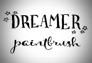
I went ahead and drew out what I was feeling for Day #4's prompt, "Dreamer."

In my head, I imagined a font that was all capitals but with somewhat-thin letters that had slight flourishes. So I took to Pinterest and found Lettersmith. With a few simple accent stars, I had already completed the day's challenge!
(It always looks better in ink.)
I fully intend to keep this 30-Day Challenge going--even though I skipped ahead a few days. And I can either doodle the odd days, as suggested, or use ALL of the words as prompts for lettering!
This guy is another I found on Pinterest, and he's called Bellwethers.
Some fonts, like Bellwethers, will come with optional letter flourishes (like how the P and H are swoopy-er than the other letters). Flourishes like this are a great way to draw attention to a single word or add a kind-of border to a short phrase.
You can add flourishes around your letters or directly to them, depending on the type of font you're using--printed fonts usually look better with non-connected flourishes that echo the shapes of the letters, while cursive scripts are prettier and more complete with swirly accents either around the letters or connected to them.
If you're lacking inspiration for flourishes, there are plenty of templates for those online as well!
Here's a small section of a HUGE template I found also on Pinterest--an incredible resource, honestly.
Eventually, all of these little tricks and cheats will become second nature and you won't have to rely on outside sources anymore! Once you get to that point and are feeling more confident with your lettering, you can try upping your game with thicker markers or full-blown calligraphy pens!
Use the Pitt Big Brush Artist Pen for chunky lettering that you want to cover a large area with.
For daintier fonts that still need to cover some space, try the smaller Brush Tip Pitt Artist Pen.
If you wanna get REALLY nuts, bust out a bottle of India ink and your tiniest detail brush to fill in your sketches.
It's a super quick way to fill in a lot of letters that have varying line widths.
A happy medium between using a pen and a brush and ink is one of these Niji Waterbrushes!
I filled this one with some water and (maybe not quite enough of) American Journey June Bug and wrote out my word without penciling first.
And, of course, we have actual calligraphy pen sets for those of you who are already awesome at lettering.
But even if you only master one font, there are still endless possibilities for mediums to use it with and flourishes to add to it. Plus, since to err is human, each instance will be a little bit different from the ones you've done before. And that's what hand-lettering is all about :)


